GRAPHIC DESIGN AND MARKETING AGENCY SERVING WHATCOM, SKAGIT & ISLAND COUNTIES SINCE 2000
A logo (identity) is not a brand, but a logo is an integral part of your brands experience with your audience.
Mccoycreative creates award winning logo/identity designs. Published in PRINT Magazine, HOW Magazine and Best of Logo Design for LOGOLOUNGE Master Logo Designer books 1-3.
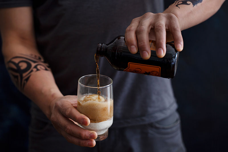
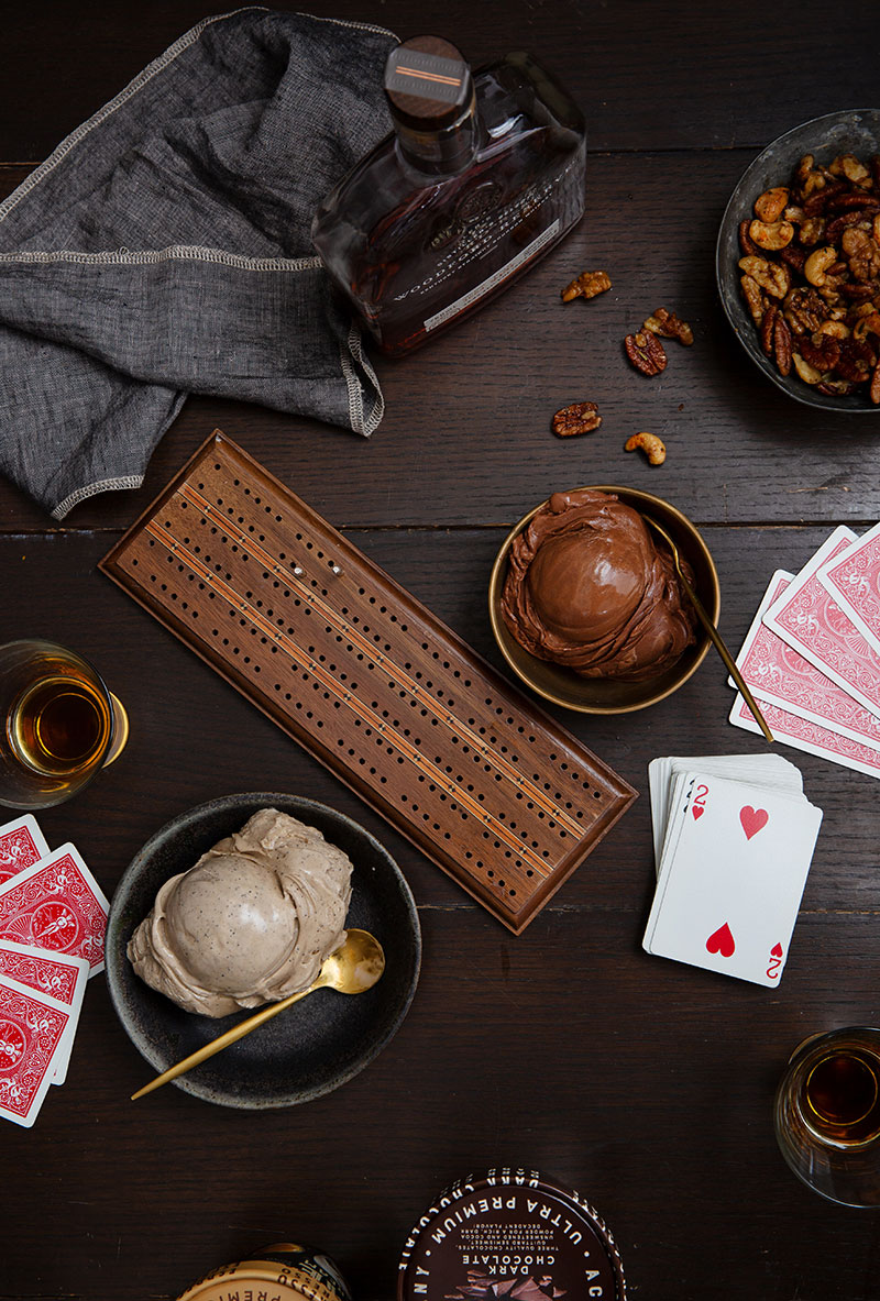
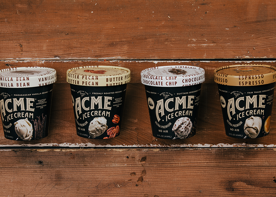
Mccoycreative helped in the rebrand of ACME Ice Cream. Twist our arms… Photography by our friend and the talented Victory Ralston, and amazing neon work by our friends at SignsPlus Bellingham.
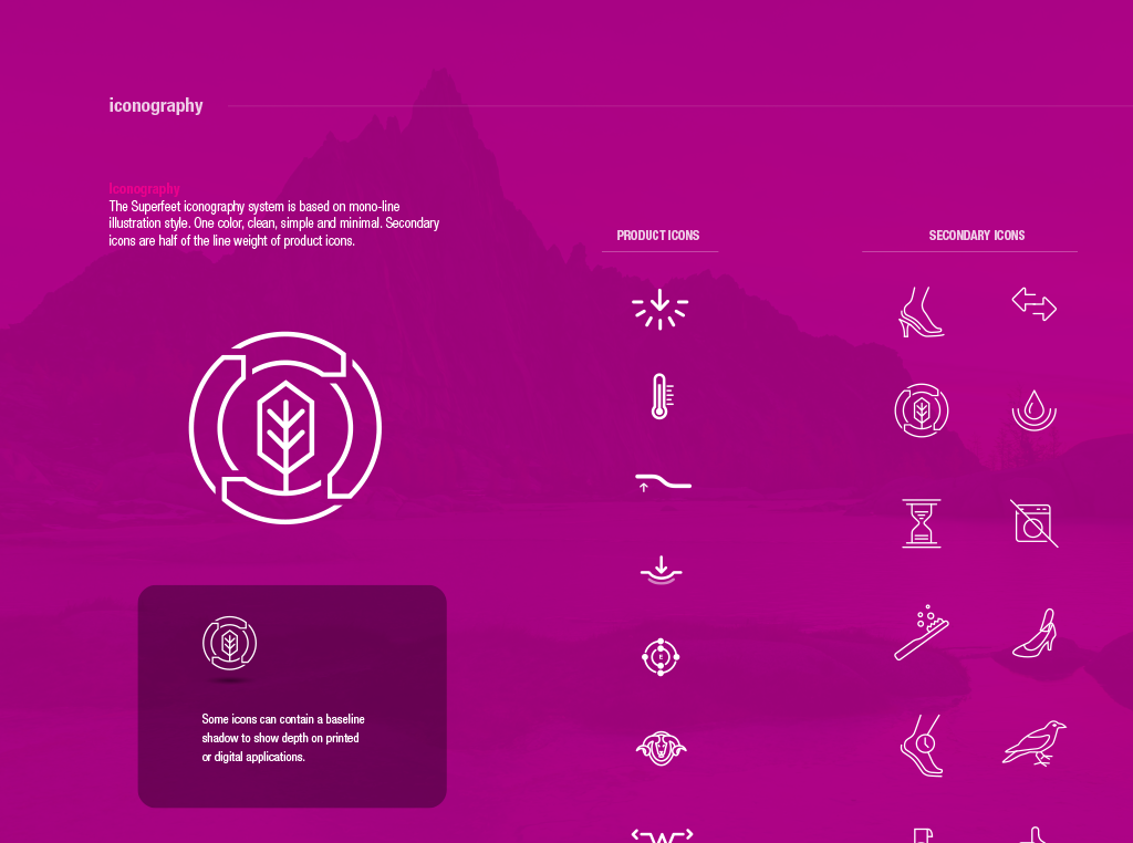
Superfeet Worldwide Inc. As creative director of Superfeet, a huge undertaking went into recreating the leader of the aftermarket insole space. Starting with a major brand redesign and refresh. New consumer packaging, trade show booth, advertisements, brochures, photography, 3D product renderings, magazine ads, in-store POP, vendor asset packages and website were part of this project. Over 90 packaging designs, and over 300 design files were produced. Included in the images to the left are some snippets from the Brand Standards book that was created to make sure the brand look and feel stayed in tact.
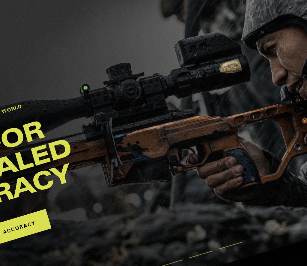
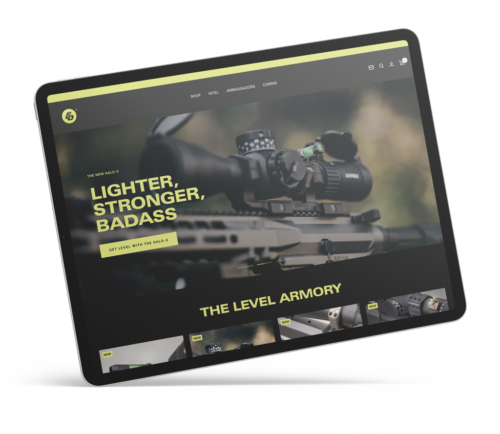
Flatline Ops is an aftermarket firearm accessory company. They manufacture the best in the business scope bubble levels for rifle systems. Starting with a single product and no brand, we helped make Flatline Ops the leader in their product space. Created Identity system, website, print materials, brand guidelines, product packaging, product branding and labels, tradeshow design, photography, advertising and product design. They now have over 30 products and continue to grow exponentially. Flatlineops.com
Mccoycreative was selected to help Mako reels establish a new vibe and brand for the new ownership. More details and work coming soon.
Work coming soon
Recently we were lucky enough to work with the amazing new owners of the Greenhouse. We experienced an exciting rebrand together, these can be so stressful. Bre and Eric were fantastic to work with and we had lots of laughs and printouts throughout this process.
More to come. Stay tuned.
Ritz-Carlton at Halfmoon Bay needed a creative, fun visitor book to show off the location and all of its' activities. I was also tasked with creating a new print and letterhead system for the resort including room card cases.
Work coming soon
Work coming soon.